Changelog
What's new
A list of changes made to the website over time.
August 31, 2026
Refined the homepage edge ruler
What changed
- Refined the homepage edge ruler with evenly distributed scales, aligned endpoint values, and horizontal vertical-axis labels that descend from 35 at the top to 0 at the bottom.
August 20, 2026
Experience timeline and navbar spacing
What changed
- The Experience timeline now ends with its content instead of extending into a large empty area.
- The desktop navbar now sits slightly below the top of the screen with full-width borders along both its top and bottom edges.
- The space above the desktop navbar now uses the site background color.
- A matching background-filled gap and full-width divider now frame the bottom edge of the desktop viewport.
- Blog article banners now clear the desktop navbar so their top frames remain fully visible.
- The homepage now centers the two calligraphic characters from the navbar logo within the open space around the central orbit: vertically above and below it on mobile, and at the middle-left and middle-right on larger screens.
- Clicking the homepage’s center icon now briefly shakes both calligraphic characters during the transition to About.
- The newsletter card now renders the profile-image API through the same optimized image handling used by the About section.
August 18, 2026
Media styling, About page visuals, and interface feedback
What changed
- The gallery lightbox now combines its subtle pattern with a translucent blurred backdrop, keeping the gallery softly visible behind the focused photo or video.
- Opening a gallery photo or video now plays a preloaded creamy keyboard sound with minimal delay.
- Gallery items can now include multilingual notes shown as large, clean, unframed typewriter text that sharpens from blur and replays whenever the lightbox opens, the active item changes, or the language switches; the subtly shadowed development editor closes after saving so the result appears immediately.
- Switching the site theme now plays the same preloaded creamy keyboard sound from the theme button, Command Palette, and Context Menu.
- Full-size images in the gallery lightbox now use square corners with an outer frame, a subtle inset image border, inner spacing, and a solid theme-aware background.
- Images in the gallery list now include the same inset image border, while patterned empty cards use the matching square, bordered, padded frame.
- Images inside blog posts and project pages now use the same square, bordered, padded treatment in both their inline and lightbox views.
- The Artix Linux setup post now includes a desktop screenshot demonstrating the updated blog image treatment.
- Markdown image text written inside
`[]`now appears beneath blog and project images within the same bordered frame, separated by a subtle top divider. - The Morse footer signature no longer shows a browser tooltip on hover.
- The About page now has mirrored compact blog-style rulers on both screen edges, where each rounded marker tracks and navigates to a page section and expands inward to show localized section names.
- The About banner dot grid now includes a stable random scattering of brighter, larger high-contrast dots, with more visual activity toward the interior and a quieter edge treatment.
- The GitHub contribution graph on the About page now uses a responsive full-width SVG with precisely aligned localized month labels, rounded activity blocks, horizontal scrolling on small screens, and localized activity tooltips.
- Project cards on the About page now avoid doubled dividers, use a dashed separator above the technology and action row on phones and tablets while retaining a solid desktop separator, and provide a roomier responsive layout on smaller screens.
August 13, 2026
Analytics trends and navbar framing
What changed
- About page insight cards now show how each metric changed from the previous period, framed by a clearer responsive grid.
- In Responsive View, the desktop navbar divider now stays within the preview frame; other pages retain their full-width divider.
August 11, 2026
Refined layouts, pixel details, and changelog clarity
What changed
- Software icons in the toolbox now use a monochrome border on hover to better match the page's visual style.
- The technology and project action row now has a subtle top divider, while a full-width bottom border neatly frames each project card.
- The GitHub contribution graph no longer shows month and weekday labels, giving the grid a cleaner presentation.
- The About introduction now uses full-width structured rows with yin-yang markers and subtle dividers.
- The transition from Home to About now features a pixel-art yin-yang, while all other site accents retain the expressive brush-style symbol.
- Brush-style yin-yang accents now invert in dark mode so they remain clearly visible.
- The desktop table of contents and framed reading progress gutter now sit vertically centered in the available viewport space.
- Each change in the newest changelog now has a dot beside it, making individual updates easier to scan.
August 6, 2026
Yin-yang reveal polish, navbar landing ring, and dotted changelog
What changed
- Smoothed the yin-yang circular reveal into the About page: the spinning icon zooms in and out in one combined, lighter animation.
- The page stays covered until the yin-yang is ready so content never flashes in first.
- The home page now opens About the moment its spin finishes.
- The navbar logo no longer shows a spinning yin-yang; the reveal icon now lands beside the logo, plays a ring effect, and fades into the text logo.
- Fixed the screen flicker and mobile off-center reveal by using a centered scale animation on a dedicated overlay instead of clipping the whole page.
- Changelog entries now present each change as a dot-bulleted list item.
August 5, 2026
Refined home visuals, the Gallery, Toolbox, and site connections
What changed
- Added a "My Desktop" section to the Toolbox, presenting a grayscale look at the Artix Linux workspace in a clean window-style frame.
- Refined the home page with a circular space icon, monochrome trigrams, a compact mobile center, accelerated ring animations, a yin-yang circular reveal into the About page that settles beside the navbar logo, and a localized hint that directs visitors to the center icon.
- The Gallery now uses a wider, fully contained page frame with matching navbar and footer boundaries.
- The centered icon-based layout selector has a clean active state.
- Subtle patterned frames complete incomplete Mosaic and Grid rows and fill the remaining space beneath shorter Masonry columns.
- The Load More control aligns with the date rows.
- Removed the "Learn more about me" button.
- Updated profile imagery across the site.
- Added a localized BaiyueSpace banner above the newsletter area.
July 25, 2026
Interactive Morse code footer signature
What changed
- Added an interactive Morse code signature for
`baichu`to the site footer, with a red outline highlight on hover or tap.
July 23, 2026
Refine responsive previews, reactions, and experience styling
What changed
- Removed the extra bottom spacing from the responsive preview page while keeping it on the rest of the site.
- Updated the moving avatar on the Experience timeline with a grayscale treatment to better match the site's visual style.
- Prevented hover preview cards from covering article content on mobile and tablet-sized screens while keeping the links directly accessible.
- Simplified article reactions by removing the UFO and face options, then reorganized the remaining buttons into a Skills-style grid with three columns on mobile and six on larger screens.
- Added smooth expanding and collapsing animations to the Projects, Honors & Awards, and Certifications lists.
- Replaced the flag dropdown with an animated language picker that floats at the center of the screen and matches the Table of Contents overlay style, with compact headers across both overlays.
July 22, 2026
Navigation, command search, and reading controls
What changed
- Desktop navigation now uses a centered, compact icon tab bar with an animated pill that highlights the current section and reveals its label.
- The mobile navbar moves smoothly between its resting and scrolled positions.
- The command palette opens as a clean search input with compact typography and a stronger backdrop for focus.
- Command palette results have a clear active highlight, no edge fade, and comfortable spacing at the first and last items.
- The back-to-top progress button is centered on general pages but stays on the right of project and blog detail pages to avoid their table-of-contents control.
July 19, 2026
Gallery organized with refined date rows
What changed
- The gallery now groups photos and videos by capture date.
- Added a centered date row above each day's media that softly fades at both edges.
July 13, 2026
SEO metadata, page previews, and sitemap
What changed
- Added richer site metadata, social preview defaults, structured data, and canonical URLs for public pages.
- Added a generated sitemap so search engines can discover public pages, posts, and projects more reliably.
July 12, 2026
Contribution graph, gallery, lightbox, and crawl guidance
What changed
Contribution graph
- Added a footer below the GitHub contribution graph with the past-year contribution total and a Less/More activity legend.
- The graph now renders empty placeholder cells in partial weeks so the final column stays visually complete.
- Removed the separate stats row above the graph so the section focuses on the contribution grid and its footer summary.
Image lightbox
- MDX and changelog image lightboxes now use the same patterned backdrop style as the gallery lightbox.
Gallery
- The gallery wrapper now uses a subtle patterned background so the image grid sits on the same visual texture as the gallery lightbox.
Crawl guidance
- Updated
`llms.txt`and`robots.txt`so public content routes are clearer and utility, auth, preview, API, and transactional routes are marked as non-canonical.
July 10, 2026
Responsive view
What changed
Responsive view
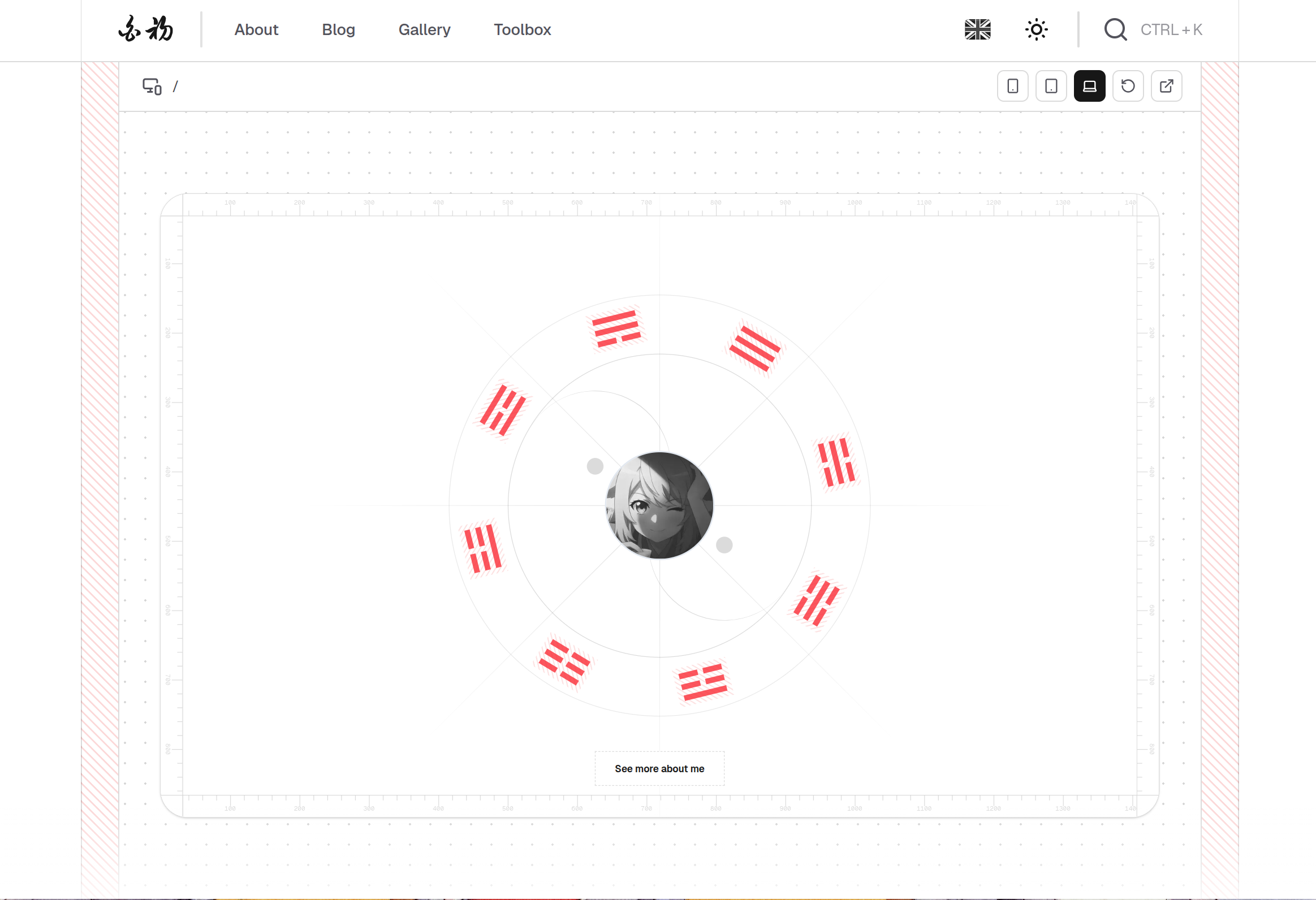
- Added Responsive view to the custom context menu, a preview tool for checking the current page at different device sizes without opening browser devtools.
Device presets
- Added iPhone, iPad, and MacBook presets that keep the correct screen ratio and auto-scale to fit the available space.
Preview layout
- The preview uses a centered dot-grid workspace, compact toolbar controls, and icon-only device buttons.
March 18, 2026
Custom right-click context menu
What changed
Context menu
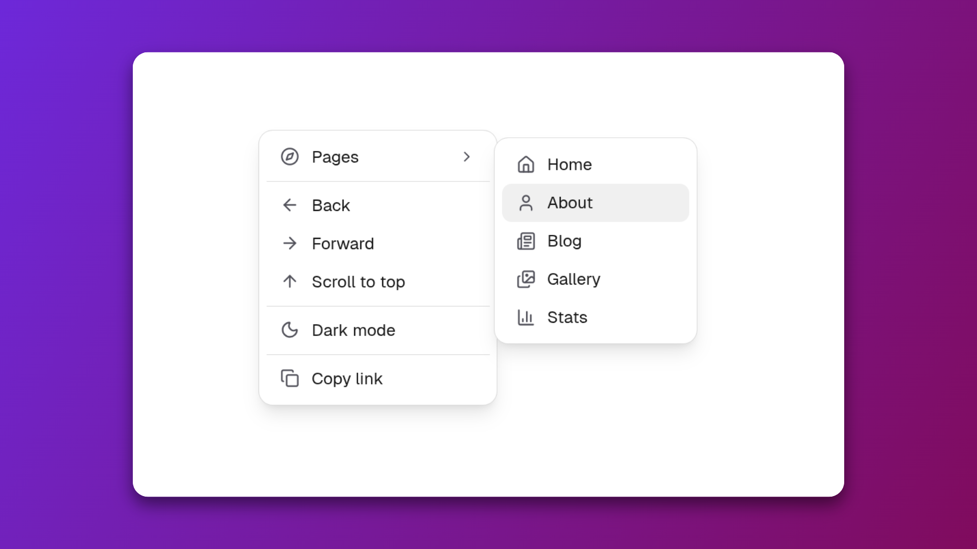
- Replaced the browser's default right-click menu with a custom context menu since
`disable-devtool`blocks it. - Added navigation actions: back, forward, and scroll to top.
- Added a Pages submenu with a hover flyout.
- Added a theme toggle and copy link.
Text selection menu
- Showed a different menu when highlighted text is right-clicked.
- Added Copy text, Search Google, and a word/character count.
Image menu
- Right-clicking an image shows Copy image, Copy image link, Open in new tab, and Download image.
Selection highlight
- Text selection now uses a yellow background highlight across the site.
>Newsletter
Stay Updated
Get notified when I publish new articles, tutorials, and project updates. Subscribe for insights and actionable content.